> ## Documentation Index
> Fetch the complete documentation index at: https://docs.autocoder.cc/docs/llms.txt
> Use this file to discover all available pages before exploring further.
# Build with Images, Files, and Voice: Multimodal AI
> How a designer rebuilt an architecture studio's website with AutoCoder's multimodal AI — using images, wireframes, flowcharts, files, and voice.
## The Designer Who Never Typed a Prompt
*How a brand designer rebuilt an architecture studio's website by uploading pictures, documents, and one voice message — using AutoCoder's multimodal editing.*
Emily Carter has been a brand designer for six years, and her portfolio has never escaped three colors: black, white, and gray. Her friends call it a condition. She calls it conviction — a website for an architecture studio should look like the architecture itself: concrete, glass, light, and nothing else.
This spring, a small architecture practice called ARCH STUDIO came to her with a modest budget and an honest brief: "Nothing fancy. We just want it to look expensive." She spent two weeks on the design. A black-and-white hero shot of a cantilevered minimalist building. Two words in the center: MINIMAL ARCHITECTURE. Four service blocks below, arranged with the discipline of a floor plan. The client looked at it and said two words back: "That's it."
Then came the question every designer dreads: "So when does the website go live?"
She was a designer. Not a developer.
***
## The three weeks of classic disasters
What followed was the full anthology of a designer trying to ship a website. Freelance quotes started at two thousand dollars with a one-month wait. She tried learning to code — on day three, she lost the navigation bar inside a flexbox and stared at the screen for half an hour. She tried a template builder, and the result looked like Tadao Ando crammed into a real estate flyer: functional, but her aesthetics wouldn't allow it. The low point was a thirty-dollar "designer-friendly website service" that returned a homepage with a gradient background and rainbow rounded buttons.
So she exported her black-and-white design one more time, at maximum resolution, and stared at it. Every line in that image was correct. The only problem was that it was a picture, not a website.
That night, in a developer community, she came across a tool called [AutoCoder](https://www.autocoder.cc/platform?utm_source=blog\&utm_medium=latest\&utm_campaign=MultimodalAI "AutoCoder AI app builder with multimodal editing"). The pitch sounded too simple: give it your design, and it builds the site. She was skeptical. She dragged her screenshot into the upload box — no prompt, no explanation, not a single word.
She wanted to see whether it could understand the things a designer doesn't say out loud.
***
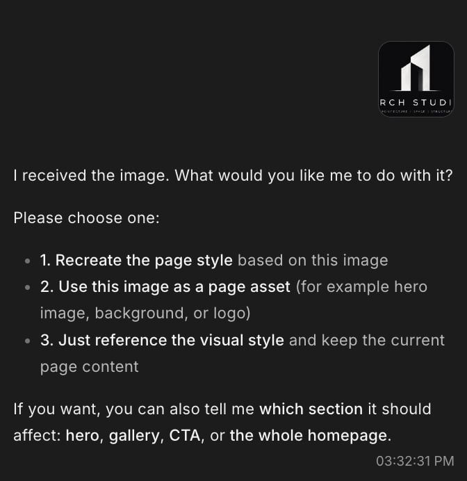
## "I received the image. What would you like me to do with it?"
That was AutoCoder's first reply. Not a guess — a question, with three options: recreate the page style from the image, use it as a page asset, or take it as a visual reference only. Then it asked which section the image should affect.
 She typed her first and only real instruction of the day: build this website.
A few minutes later, a working draft appeared. Dark, monochrome, editorial. The bones of her design were there — the typography, the spacing rhythm, the restraint. It wasn't a flattened mockup; it was a real page with navigation, sections, and a structure AutoCoder had inferred from a single image.
She typed her first and only real instruction of the day: build this website.
A few minutes later, a working draft appeared. Dark, monochrome, editorial. The bones of her design were there — the typography, the spacing rhythm, the restraint. It wasn't a flattened mockup; it was a real page with navigation, sections, and a structure AutoCoder had inferred from a single image.
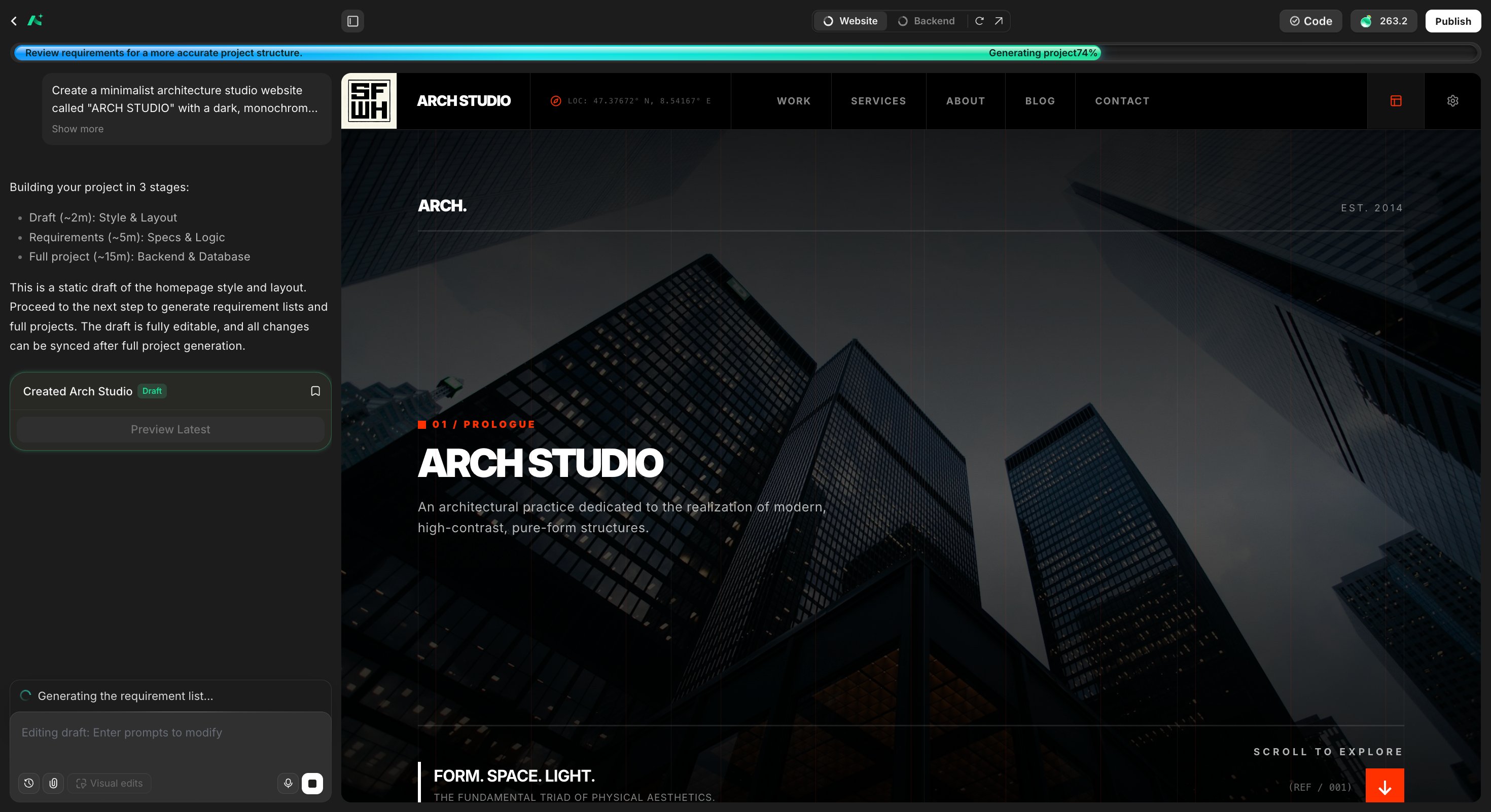 But something was off. The logo in the corner was an abstract maze-like mark AutoCoder had invented on its own. Clever, but not the brand.
***
## Round one: the logo
In a text-only tool, this is where the pain begins. You'd type "replace the logo," then describe the colors, the proportions, the mood — and hope the machine's imagination matches yours.
Emily Carter just uploaded the studio's actual logo file and said: replace it, change nothing else.
Done. The new mark sat in the navigation bar exactly where it belonged.
But something was off. The logo in the corner was an abstract maze-like mark AutoCoder had invented on its own. Clever, but not the brand.
***
## Round one: the logo
In a text-only tool, this is where the pain begins. You'd type "replace the logo," then describe the colors, the proportions, the mood — and hope the machine's imagination matches yours.
Emily Carter just uploaded the studio's actual logo file and said: replace it, change nothing else.
Done. The new mark sat in the navigation bar exactly where it belonged.
 But stepping back, she felt the page still wasn't *theirs*. The gray was too heavy. The type was close but not the studio's voice. How do you type that feeling into a chat box? "Make the gray 15% lighter and the typography more editorial" is a guess dressed up as an instruction.
So she didn't type it. She uploaded her original design again — this time as a style reference.
But stepping back, she felt the page still wasn't *theirs*. The gray was too heavy. The type was close but not the studio's voice. How do you type that feeling into a chat box? "Make the gray 15% lighter and the typography more editorial" is a guess dressed up as an instruction.
So she didn't type it. She uploaded her original design again — this time as a style reference.
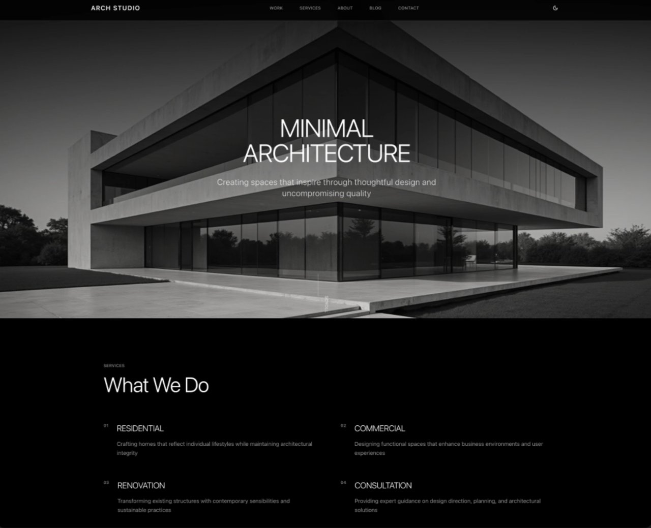 The page came back transformed: a softer grayscale, lighter editorial typography, airier whitespace. Same content, same structure — but now it breathed like her design. She hadn't described a single hex code. She had shown, and the machine had seen.
 ***
## Round two: the client's wireframe
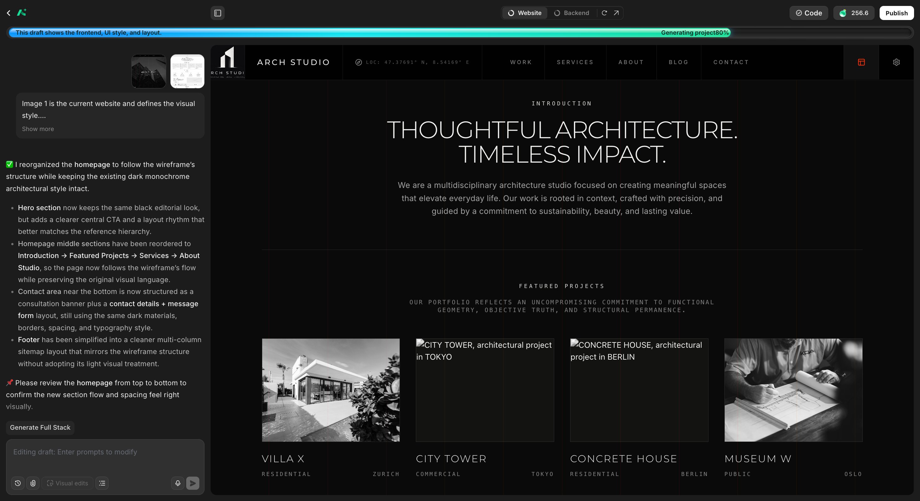
The client's feedback arrived the next morning: "The look is right. The homepage structure is wrong." Attached was a wireframe — Introduction first, then Featured Projects, then Services, then About, with a consultation banner and a contact form near the bottom.
***
## Round two: the client's wireframe
The client's feedback arrived the next morning: "The look is right. The homepage structure is wrong." Attached was a wireframe — Introduction first, then Featured Projects, then Services, then About, with a consultation banner and a contact form near the bottom.
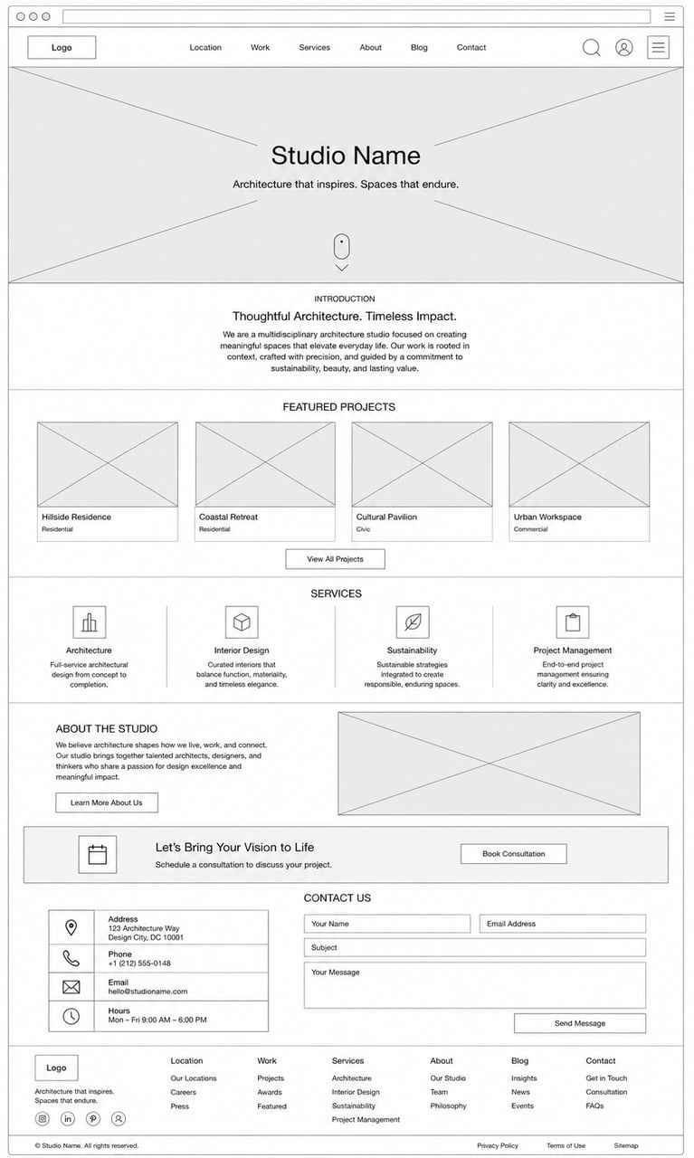 Explaining a page structure in words is a special kind of torture. "Move section three above section two, but keep the hero, and split the contact area into two columns" — every sentence invites a misunderstanding. A wireframe, on the other hand, is unambiguous by definition.
She uploaded two images together: the current site for style, the wireframe for structure. Her instruction was one line — reorganize by the wireframe, keep the visual style exactly as it is.
[AutoCoder](https://www.autocoder.cc/platform?utm_source=blog\&utm_medium=latest\&utm_campaign=MultimodalAI "Reorganize a website from a wireframe with AutoCoder") rebuilt the homepage flow: Introduction → Featured Projects → Services → About Studio → consultation banner → contact details + form, footer simplified into the wireframe's sitemap layout. And crucially, it kept the dark monochrome language intact. Two images, two jobs: one defined how it should look, the other defined how it should be arranged.
Explaining a page structure in words is a special kind of torture. "Move section three above section two, but keep the hero, and split the contact area into two columns" — every sentence invites a misunderstanding. A wireframe, on the other hand, is unambiguous by definition.
She uploaded two images together: the current site for style, the wireframe for structure. Her instruction was one line — reorganize by the wireframe, keep the visual style exactly as it is.
[AutoCoder](https://www.autocoder.cc/platform?utm_source=blog\&utm_medium=latest\&utm_campaign=MultimodalAI "Reorganize a website from a wireframe with AutoCoder") rebuilt the homepage flow: Introduction → Featured Projects → Services → About Studio → consultation banner → contact details + form, footer simplified into the wireframe's sitemap layout. And crucially, it kept the dark monochrome language intact. Two images, two jobs: one defined how it should look, the other defined how it should be arranged.
 ***
## Round three: the flowchart
A week later, the client wanted more: a proper consultation flow. Five steps — contact details, project type, project information, reference file uploads, then review and submit — with validation that keeps users on the current step if required fields are missing.
***
## Round three: the flowchart
A week later, the client wanted more: a proper consultation flow. Five steps — contact details, project type, project information, reference file uploads, then review and submit — with validation that keeps users on the current step if required fields are missing.
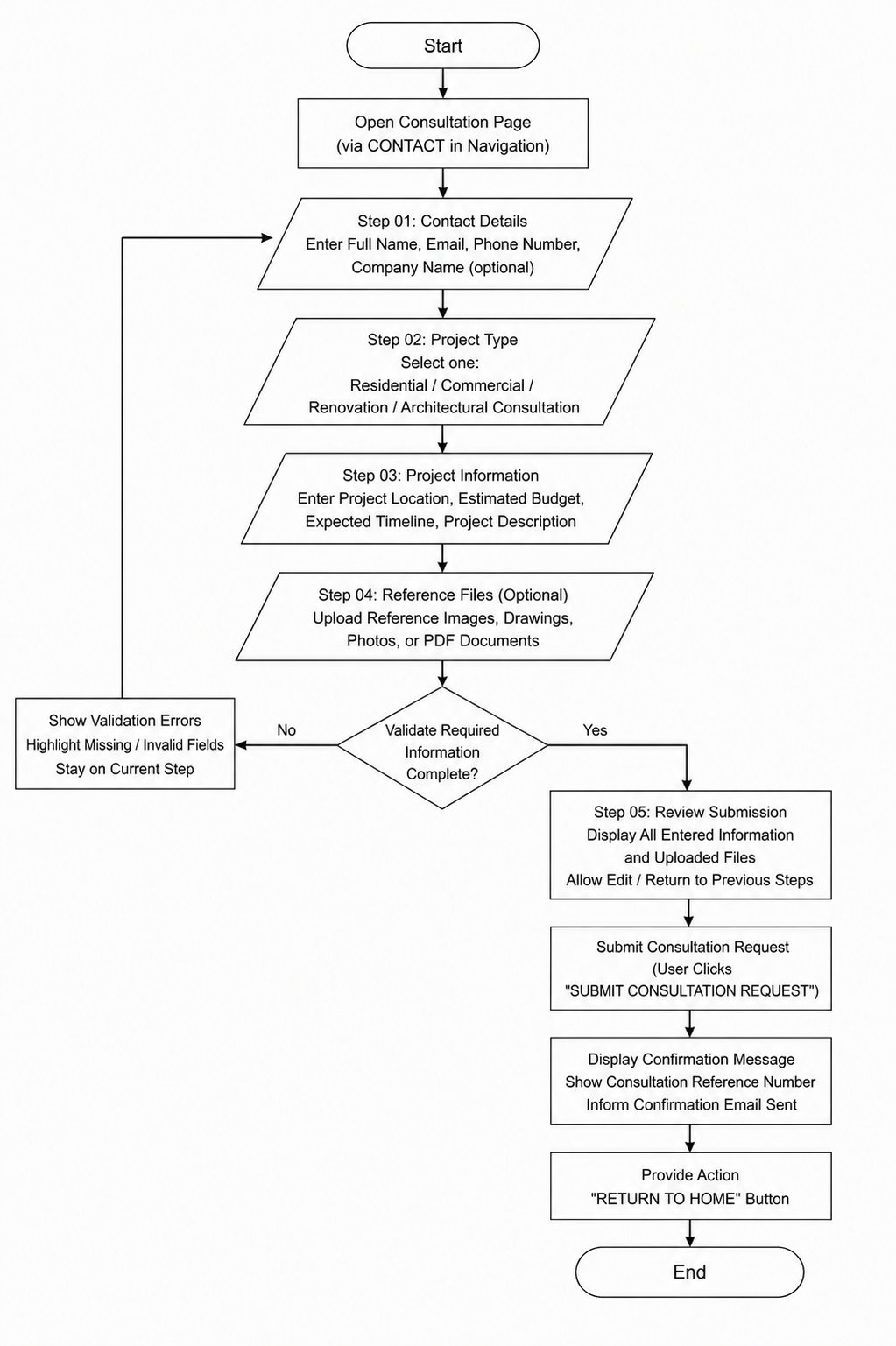 This is the kind of requirement that dies in text. Branching logic, validation rules, entry points — type it all out and something gets lost. Instead, the client had drawn a flowchart. Emily Carter forwarded it, unchanged, with a single sentence: modify the site according to this flowchart.
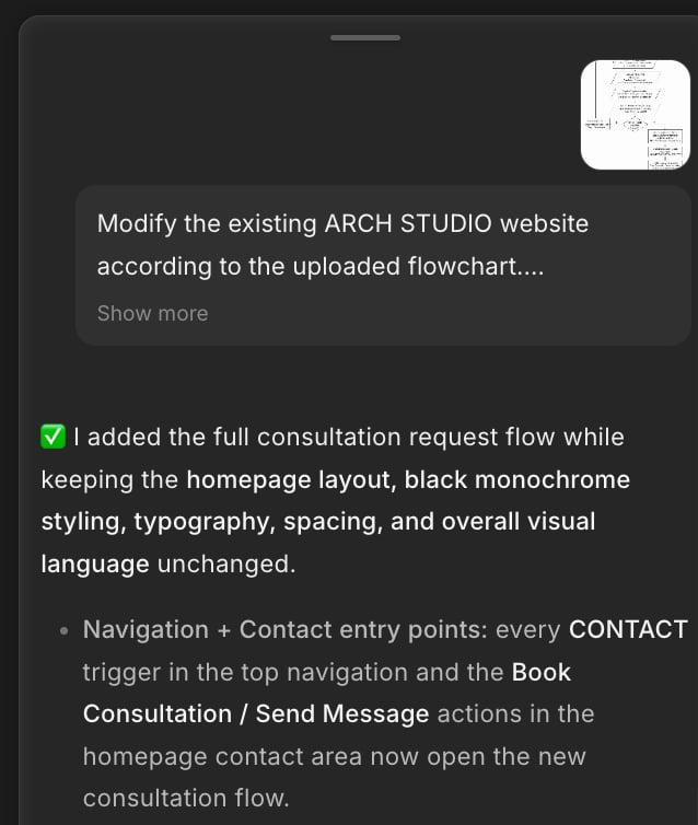
The reply read like a build report from a careful engineer: every CONTACT entry in the navigation and every consultation button on the homepage now opened the new five-step flow; the homepage layout, styling, typography, and spacing were untouched. The branching validation — the part she would have spent an hour describing — had simply been read off the diagram.
This is the kind of requirement that dies in text. Branching logic, validation rules, entry points — type it all out and something gets lost. Instead, the client had drawn a flowchart. Emily Carter forwarded it, unchanged, with a single sentence: modify the site according to this flowchart.
The reply read like a build report from a careful engineer: every CONTACT entry in the navigation and every consultation button on the homepage now opened the new five-step flow; the homepage layout, styling, typography, and spacing were untouched. The branching validation — the part she would have spent an hour describing — had simply been read off the diagram.
 ***
## The moment it proved it was keeping score
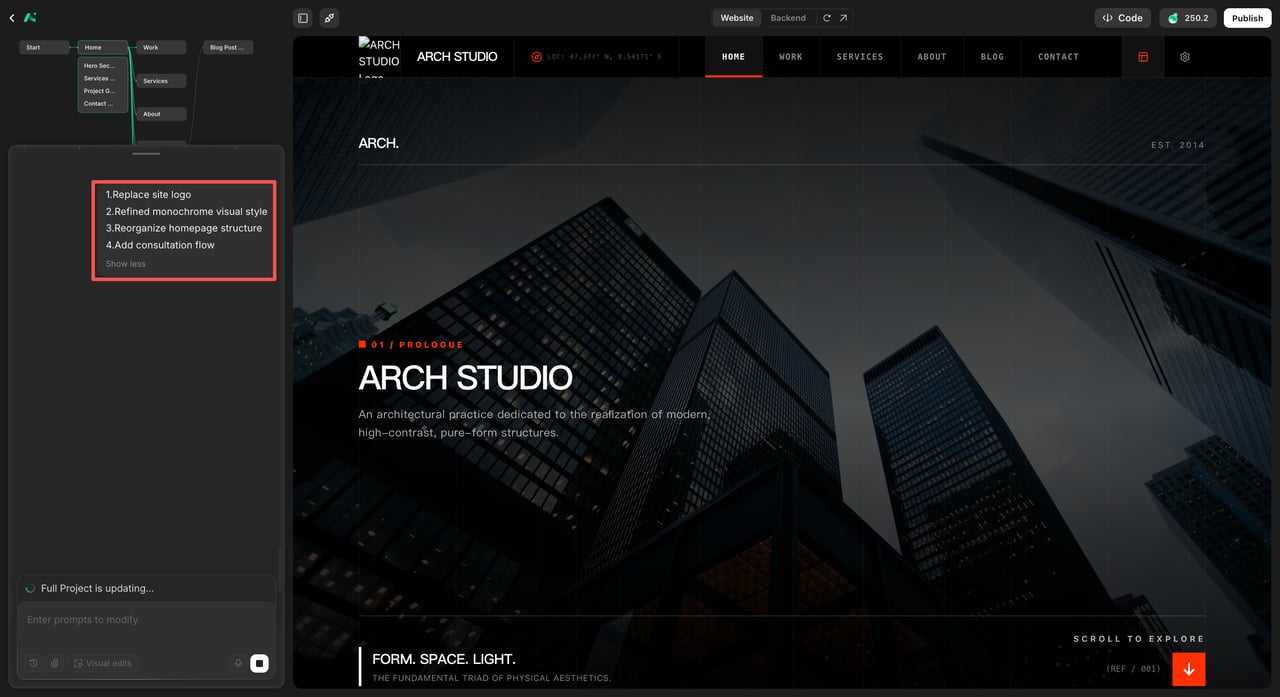
With the draft in good shape, she clicked through to generate the full project. Before building, AutoCoder paused and presented a confirmation list:
1. Replace site logo
2. Refined monochrome visual style
3. Reorganize homepage structure
4. Add consultation flow
Four items — one for every image she had uploaded along the way. It hadn't treated each upload as an isolated request; it had been keeping a ledger. Every picture she ever fed it was still part of the specification. She confirmed, and the full stack — frontend, backend, database — generated around everything the images had said.
***
## The moment it proved it was keeping score
With the draft in good shape, she clicked through to generate the full project. Before building, AutoCoder paused and presented a confirmation list:
1. Replace site logo
2. Refined monochrome visual style
3. Reorganize homepage structure
4. Add consultation flow
Four items — one for every image she had uploaded along the way. It hadn't treated each upload as an isolated request; it had been keeping a ledger. Every picture she ever fed it was still part of the specification. She confirmed, and the full stack — frontend, backend, database — generated around everything the images had said.
 ***
## Round four: the red circle
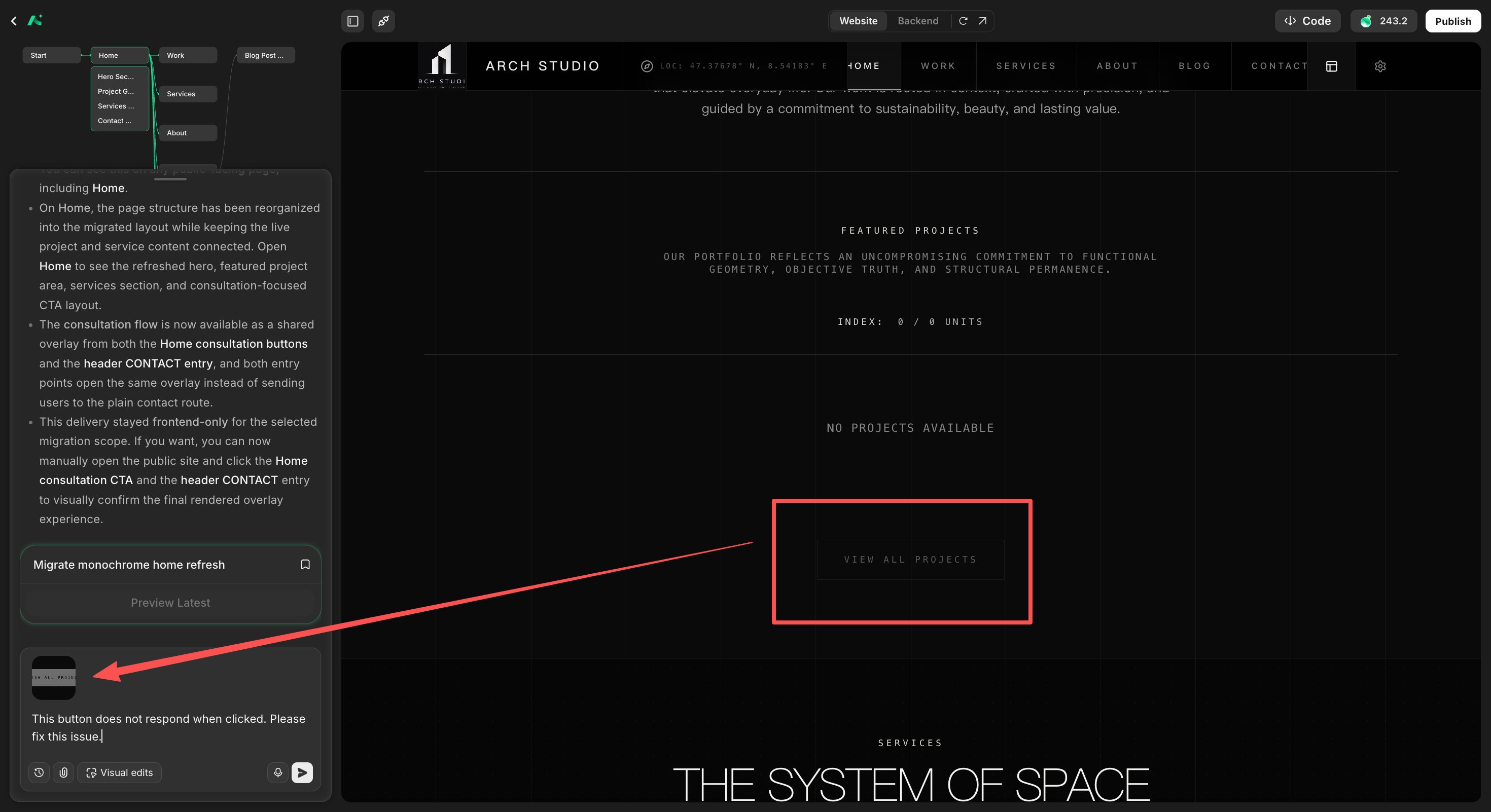
Testing the result, she found a bug: the VIEW ALL PROJECTS button didn't respond to clicks.
The old way to report this: "On the homepage, in the Featured Projects section, the button below the project grid, the one that says…" She didn't bother. She screenshotted the button — a thumbnail barely bigger than a stamp — and sent it with eleven words: "This button does not respond when clicked. Please fix this issue."
It knew exactly which button she meant. When you can point at the problem, you never have to describe its location. That's not a convenience; it's an entire category of miscommunication eliminated.
***
## Round four: the red circle
Testing the result, she found a bug: the VIEW ALL PROJECTS button didn't respond to clicks.
The old way to report this: "On the homepage, in the Featured Projects section, the button below the project grid, the one that says…" She didn't bother. She screenshotted the button — a thumbnail barely bigger than a stamp — and sent it with eleven words: "This button does not respond when clicked. Please fix this issue."
It knew exactly which button she meant. When you can point at the problem, you never have to describe its location. That's not a convenience; it's an entire category of miscommunication eliminated.
 ***
## Round five: the document
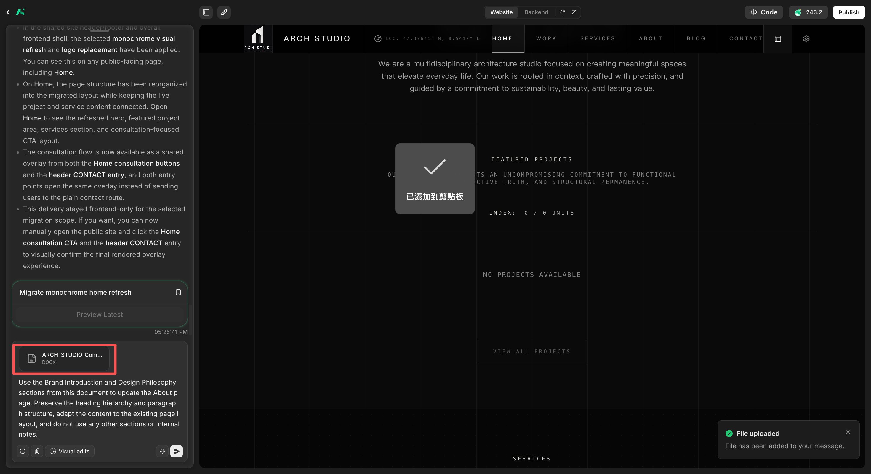
Then the client sent the official company profile — a Word document — and asked for the About page to use the formal version of the studio's story.
She uploaded the DOCX directly: use the Brand Introduction and Design Philosophy sections, keep the heading hierarchy, adapt to the existing layout, and don't touch anything else. The About page came back rewritten in the client's official voice, structure preserved, the rest of the site undisturbed. No copy-pasting into a chat box, no reformatting, no "please ignore the headers and footnotes."
***
## Round five: the document
Then the client sent the official company profile — a Word document — and asked for the About page to use the formal version of the studio's story.
She uploaded the DOCX directly: use the Brand Introduction and Design Philosophy sections, keep the heading hierarchy, adapt to the existing layout, and don't touch anything else. The About page came back rewritten in the client's official voice, structure preserved, the rest of the site undisturbed. No copy-pasting into a chat box, no reformatting, no "please ignore the headers and footnotes."
 ***
## The last change, spoken
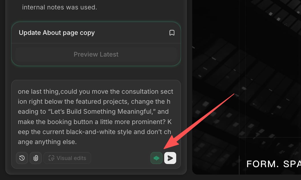
By the end, only small things remained — the kind of polish that feels too petty to type. Move the consultation section below the featured projects. Rename the heading. Make the booking button a bit more prominent. Keep everything else.
She held the microphone button and just said it, in one unedited breath: *"One last thing, could you move the consultation section right below the featured projects, change the heading to 'Let's Build Something Meaningful,' and make the booking button a little more prominent? Keep the current black-and-white style and don't change anything else."*
No punctuation. No structure. The way you'd actually say it to a colleague across the desk. It understood every word.
***
## The last change, spoken
By the end, only small things remained — the kind of polish that feels too petty to type. Move the consultation section below the featured projects. Rename the heading. Make the booking button a bit more prominent. Keep everything else.
She held the microphone button and just said it, in one unedited breath: *"One last thing, could you move the consultation section right below the featured projects, change the heading to 'Let's Build Something Meaningful,' and make the booking button a little more prominent? Keep the current black-and-white style and don't change anything else."*
No punctuation. No structure. The way you'd actually say it to a colleague across the desk. It understood every word.
 ***
## What the pictures said that words couldn't
Looking back at the whole build, Emily Carter noticed something about her own behavior: every time the requirement was visual, structural, or procedural, she had reached for an image instead of the keyboard. Not because typing is slow — because typing is a *translation*. A text-only workflow forces a designer to convert what she sees into words, then forces the machine to convert those words back into visuals. Two translations, two chances for meaning to leak.
Multimodal editing removes both. The logo carried the brand. The style image carried the mood. The wireframe carried the structure. The flowchart carried the logic. The screenshot carried the location of the bug. The document carried the official voice. The voice message carried the last ounce of her patience. Each asset did the job that paragraphs of prompting would have done worse.
Her design is now a living website — backend, database, consultation flow and all — and the strangest part of the story is still the first one: she began by uploading a picture and saying nothing at all.
If you have a design trapped in a screenshot, you can start the same way she did — at [autocoder.cc](https://www.autocoder.cc/platform?utm_source=blog\&utm_medium=latest\&utm_campaign=MultimodalAI "Turn a design screenshot into a working website"). Upload the image. Let it ask you the question.
***
## What the pictures said that words couldn't
Looking back at the whole build, Emily Carter noticed something about her own behavior: every time the requirement was visual, structural, or procedural, she had reached for an image instead of the keyboard. Not because typing is slow — because typing is a *translation*. A text-only workflow forces a designer to convert what she sees into words, then forces the machine to convert those words back into visuals. Two translations, two chances for meaning to leak.
Multimodal editing removes both. The logo carried the brand. The style image carried the mood. The wireframe carried the structure. The flowchart carried the logic. The screenshot carried the location of the bug. The document carried the official voice. The voice message carried the last ounce of her patience. Each asset did the job that paragraphs of prompting would have done worse.
Her design is now a living website — backend, database, consultation flow and all — and the strangest part of the story is still the first one: she began by uploading a picture and saying nothing at all.
If you have a design trapped in a screenshot, you can start the same way she did — at [autocoder.cc](https://www.autocoder.cc/platform?utm_source=blog\&utm_medium=latest\&utm_campaign=MultimodalAI "Turn a design screenshot into a working website"). Upload the image. Let it ask you the question.