AutoCoder.cc is designed to turn ideas into working products quickly. But like any powerful collaborator, the quality of what you get depends heavily on how you communicate. A vague prompt produces a vague result. A clear prompt unlocks speed, quality, and precision. This guide explains how to prompt AutoCoder.cc effectively, why it matters, and how small changes in wording can dramatically improve outcomes.

Why prompt quality matters

Better prompts = better results, faster and more efficient

Using AutoCoder.cc is less like issuing commands and more like working with a highly skilled teammate. It understands intent, makes decisions, and fills in gaps. From internal testing, well-structured prompts consistently lead to:
  • 30–40% faster generation time with fewer unnecessary files and less rework
  • Smarter UX decisions aligned with the product’s actual goal
  • Cleaner, more maintainable code that’s easier to extend later
  • Lower credit usage due to fewer ration cycles
In short: better prompts don’t just improve results, they make the entire build process more efficient.

The Framework: Three Inputs That Drive Great Prompts

After building hundreds of applications ourselves and learning from AutoCoder.cc power users, we’ve noticed that great prompts are not accidental. They follow a clear structure. The most effective prompts consistently include three core inputs.
  1. Product surface
  2. Context of use
  3. Constraints & taste
Here’s the template:
Build [product surface: components, data, actions].

Used by [who],
in [what moment],
to [what decision or outcome].

Constraints:
- platform / device
- visual tone
- layout assumptions
Let’s break down each input.

Product surface

What actually exists in the product? The product surface describes what the user can see and interact with. This is the foundation of the prompt. Think in terms of components, data, and actions.

Example:

 Build a mobile app with a workout tracker, exercise library, progress charts and actions to log workouts, set goals, and track calories

 Used by fitness enthusiasts
 in daily workout sessions
 to track performance and plan exercise routines

 Constraints
 iOS and Android
 Clean, energetic, motivating
 Single-column layout with bottom navigation
Why this works? It clearly defines visible components. It anchors UX and data structure. It reduces unnecessary features.

Context of use

Who is using it, when, and for what outcome Context turns a collection of components into a real product. This input answers three questions:
  • Who the user is?
  • When they use the product?
  • What decision or outcome they care about?
  • How much time do they have?
AutoCoder.cc uses this information to prioritize flows, simplify UX, and make trade-offs automatically.

Example:

Build a trip itinerary planner

Used by solo travelers
in the days leading up to their trip
to decide which attractions and activities to prioritize

Constraints
Web and mobile
Friendly, light, engaging
Tabbed layout with map integration
Why this works? It identifies the user type, time constraints, and primary outcome. AutoCoder.cc can optimize flows for speed and clarity, reducing unnecessary screens.

Constraints and taste

How the product should feel and what to avoid Constraints prevent overbuilding. Taste guides visual and structural decisions. Without this input, AutoCoder.cc may default to overly general or feature-heavy solutions.

Example:

Build an online learning dashboard with course modules, progress tracking, and quiz interfaces

Used by high school students
in after-school study sessions
to decide what topics to focus on next

Constraints
Web and tablet
Minimal, clean, modern
Two-column layout with sidebar navigation
Why this works? It sets clear boundaries, communicates both constraints and taste, and helps AutoCoder.cc stay aligned with the product vision.

Show the difference: Real test results

We ran a series of tests to understand how each input of the framework affects AutoCoder’s output. Here are the results.

Test 1: The impact of context of use

Without context of use
Build an e-commerce site with product grid, filters, and shopping features
Alt text With context of use
Build a fashion e-commerce website targeting millennials (25-35) who shop online for trendy outfits and seasonal collections. Create a product listing page with grid of high-resolution product images, product names, prices, quick view buttons, and filters for size, color, and category. Build a product detail page with image gallery, product title, price, description, size and color selectors, add-to-cart and wishlist buttons, and customer reviews. Include a clean header with logo, search bar, navigation menu, and cart icon. Use a soft pastel color palette featuring macaron blues and pinks, subtle gradients, and rounded buttons. Modern, minimal, and premium aesthetic. Prioritize fast load, responsive layout, and intuitive navigation.

Used by millennials shopping online
in their free time at home or during break
to discover trending fashion and make purchases efficiently

Constraints
Desktop and tablet first
Macaron blue and pink color palette
Grid-based layout for product listings, responsive product detail pages, consistent typography and spacing, rounded UI elements, subtle gradients
Alt text Alt text What changed
  • Without context:
    • Search bar was non-functional
    • Cart only placeholder, could not add products
    • Product images not optimized for desktop/tablet
    • Layout not visually aligned with target audience or aesthetics
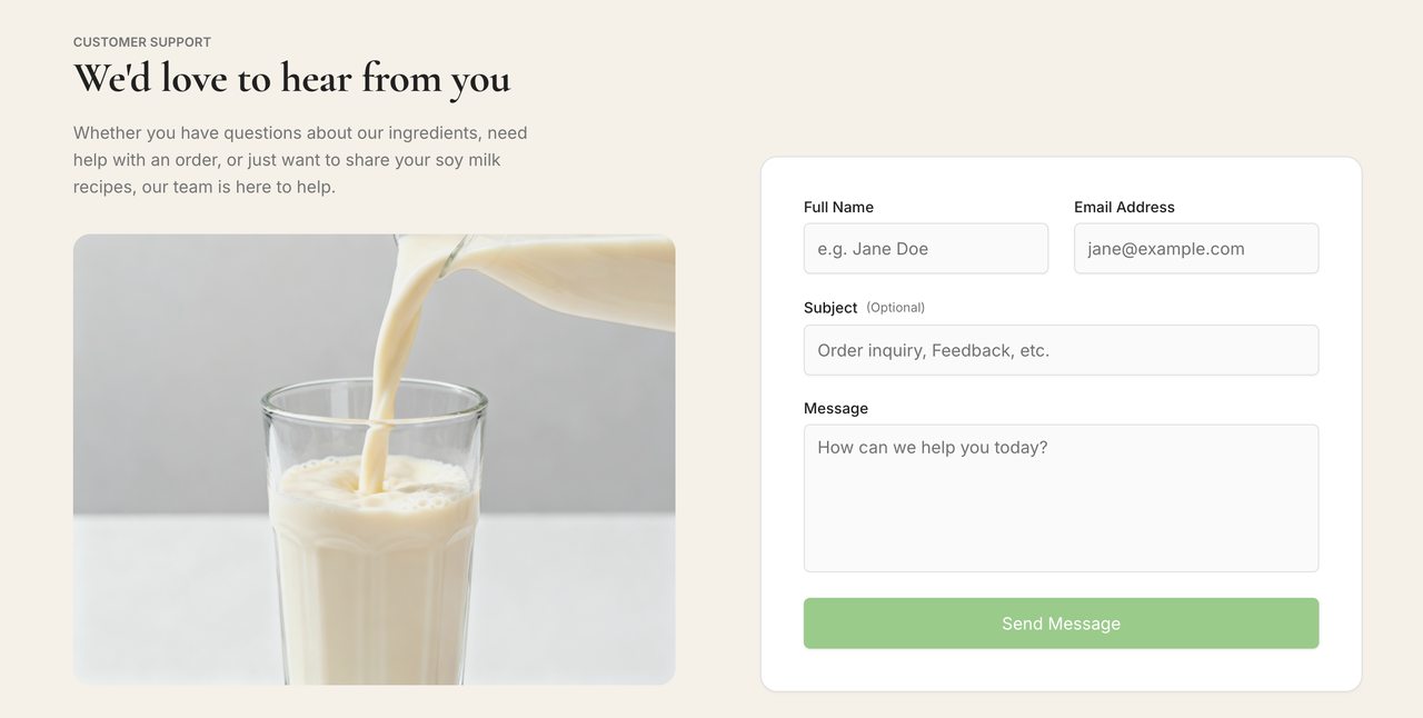
  • With context:
    • Fully functional search and cart with quantity controls
    • High-resolution product images with quick view modals
    • Responsive desktop/tablet layout
    • Macaron blue and pink color palette with subtle gradients
    • Intuitive navigation and premium, minimalistic design

Test 2: The impact of product surface

Vague product surface
> Build a website for a food product
Alt text Specific product surface
Build a soymilk brand website showcasing different product variants. Include homepage with hero banner, featured products section with images and brief descriptions, product detail pages with nutritional info and ingredients, "Buy Now" buttons linked to online store, FAQ section addressing common questions, and a Contact section with inquiry form and social links. Use a soft beige background with pastel green buttons, clean modern typography, ample white space, and subtle hover effects. Sticky navigation bar with smooth scrolling between sections. Fully responsive for desktop and tablet.

Used by customers interested in healthy beverages
when exploring online to learn about products and make purchases
to browse product variants, read details, ask questions, and complete purchases

Constraints
Desktop and tablet first
Beige background with pastel green buttons
Minimal, clean, modern aesthetic
Responsive layout, clear hierarchy, hover effects on buttons, interactive FAQ toggles
Alt text Alt text What changed
  • Without product surface:
    • Single generic page with no structure, features, or styling
  • With specific product surface:
    • Homepage with hero banner and featured products
    • Product pages with nutritional info, ingredients, and Buy Now buttons
    • FAQ section with collapsible answers, functional Contact form
    • Beige + pastel green color scheme, clean modern typography
    • Fully responsive layout with subtle hover effects

Test 3: The impact of constraints and taste

Basic constraints
Build a travel website

Used by users
in general browsing
to explore destinations

Constraints
Desktop
Basic layout
Standard colors
Alt text Detailed constraints
Build an Indian tourism website showcasing top destinations, sacred sites, cultural experiences, and curated tour packages. Include hero banner with vibrant image of India and tagline. Sections: About Us with agency info, Sacred Destinations highlighting temples and historical sites, Experiences featuring activities like river cruises, local markets, and festivals, Tour Packages with pricing and booking buttons, and Contact section with inquiry form. Use a bright, culturally inspired palette (saffron, teal, magenta) with complementary neutral tones. Rounded buttons, modern typography, smooth hover effects, subtle parallax scrolling, and interactive destination cards. Sticky navigation with smooth scrolling between sections. Fully responsive for desktop and tablet.

Used by travelers planning trips to India
when exploring online for vacation ideas and bookings
to discover destinations, plan itineraries, and book experiences efficiently

Constraints
Desktop and tablet first
Bright Indian-inspired color palette (saffron, magenta)
Modern, vibrant, premium aesthetic
Responsive layout, hover effects, parallax scrolling, interactive buttons, clear hierarchy for sections
Alt text Alt text What changed
  • Without constraints:
    • Generic travel website, sections vague
    • Layout plain, colors default
    • No interactive elements, hero image static
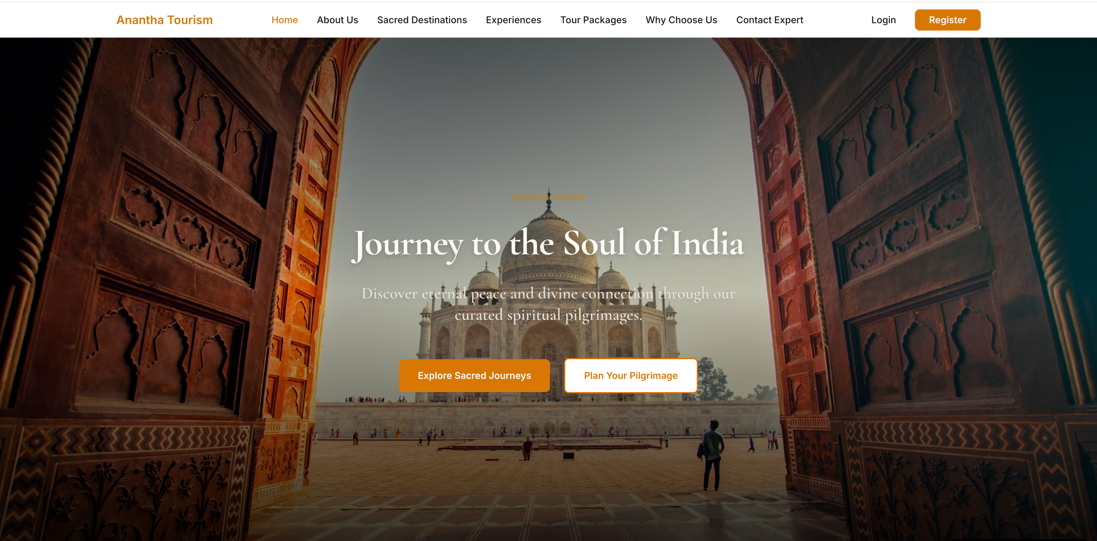
  • With detailed constraints:
    • Fully structured sections: About Us, Sacred Destinations, Experiences, Tour Packages, Contact
    • Interactive destination cards with hover effects
    • Booking buttons functional
    • Hero banner vibrant, parallax scrolling
    • Color palette inspired by Indian culture (saffron, magenta)
    • Fully responsive desktop/tablet layout, modern typography

Final takeaway

Great prompts are not longer. They are structured. By consistently using product surface, context of use, and constraints & taste, you reduce iteration, save credits, and get outputs that align with your intent from the start. Ready to turn your ideas into fully functional, beautiful websites in a single iteration? Start prompting AutoCoder.cc today and see your concepts come to life.